The Unlucky House – Before Pics
Here are some BEFORE pictures of The Unlucky House:
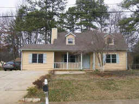
Front View of House
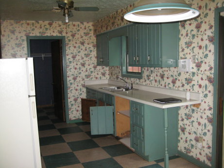
Kitchen
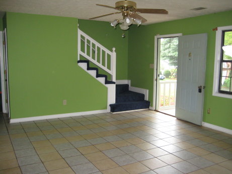
Living Room
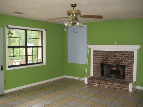
More Living Room
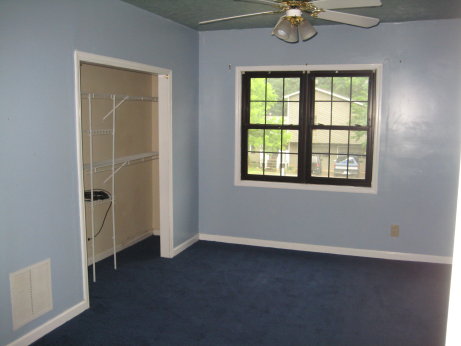
Bonus Room (Converted Garage)
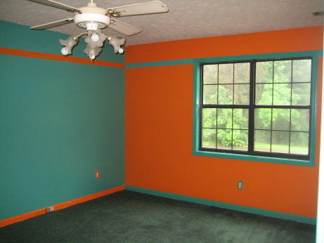
Master Bedroom
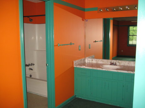
Master Bath
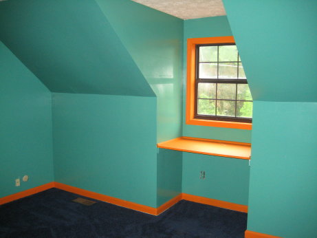
Second Bedroom
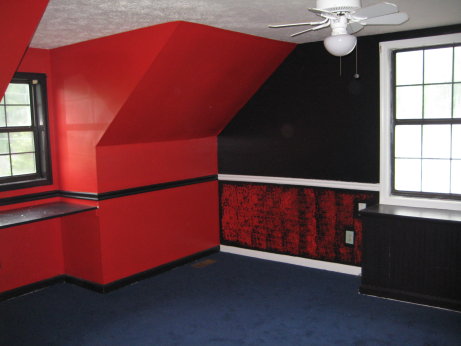
Third Bedroom
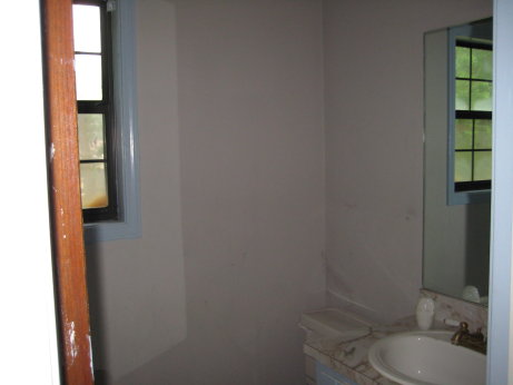
Guest Bathroom
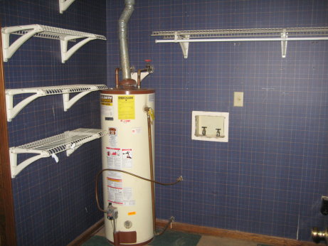
Laundry Closet
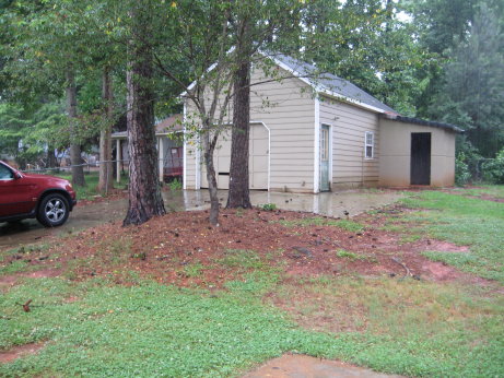
Detached Garage/Workshop
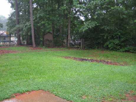
Back Yard




Whats the deal with this place?
You’ll find out tomorrow… 🙂
This place should be named the “crazy colors house”. Its worse then the Sunglasses House!
I see a lot of potential for this house visually. This could be a good centerpiece advertisement flip for Lish. Hope all goes well with it.
Its funny the worse the house to begin with the better is always comes out.
I have a good feeling about the Sunglasses House, that’s the worst one yet!
Looks like it was a Bordello before you got it 😉 haha
-Hakrjak
This is going to be an interesting rehab. Unlike some in the past, our budget isn’t big enough to completely gut this place and do everything we want. So, we’re going to have to be very strategic about how we spend our money and always on what things don’t get renovated as much as we’d like.
For example, we’re trying to decide what to do with that big tiled living room floor. Hardwoods are likely out of our price range on this one, so do we keep the tile (with a nice huge throw-rug) or do we carpet it?
Decisions, decisions…
Even the super on sale laminate wood flooring at Home Depot would be better than that tile floor for around 1.70 a sq. ft!!
See, it’s houses like these that just make me think, now why didn’t I ever consider teal for trim color – it obviously works so well.
Why stop there, lets go ahead and get two clashing colors of tile and create some concentric circles in the main living space.
Briliant!!!